Aqilla – Elegant Branding Inspired by Feminine Wisdom
At Aqilla, coffee is more than just a drink — it’s a ritual.
We carefully select the finest beans, roasted to perfection, to deliver a cup that’s bold, smooth, and unforgettable. Every sip of Aqilla is crafted to awaken your senses and brighten your day.
How to Brew Your Perfect Cup
Use 2 tbsp of Aqilla Coffee for every 180ml water.
Brew fresh with your preferred method: French Press, Drip, or Espresso.
Sip, savor, and enjoy the Aqilla experience.
Preliminary Design or Layouts
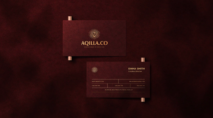
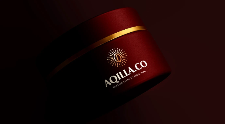
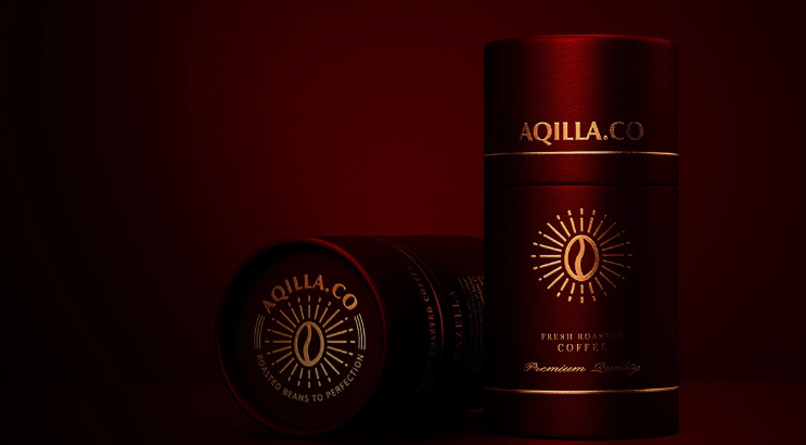
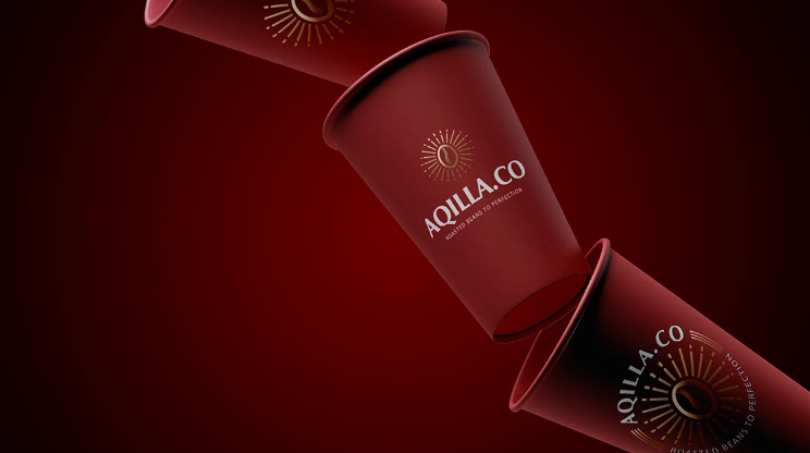
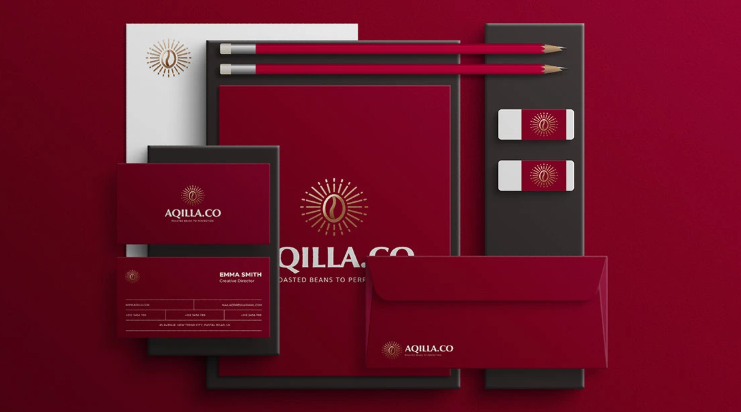
At Aqilla Coffee, the packaging design was crafted to reflect both premium quality and approachability. The clean, modern layout highlights the brand’s essence — minimal yet sophisticated.
Color Palette: Warm earthy browns and soft cream tones to evoke freshness, warmth, and natural coffee vibes.
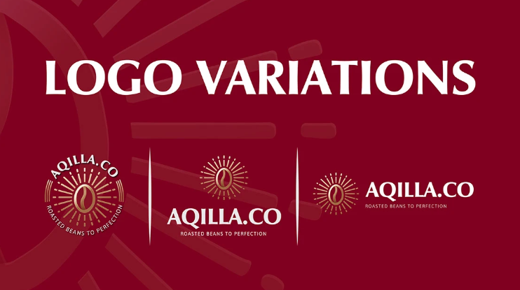
Typography: Bold sans-serif for the logo (strength and clarity), paired with elegant serif accents for descriptions (heritage and craft).
Iconography: Subtle coffee bean illustrations and brewing icons to make the packaging more intuitive and visually engaging.
Structure: Front panel emphasizes the brand name, tagline, and roast level. Side panels provide storytelling, brewing guide, and sustainability promise. Back panel highlights tasting notes and sourcing details.
Sustainability Element: Designed for eco-friendly packaging options — recyclable matte pouches with a resealable zip to keep the aroma fresh.
The result is packaging that not only protects the product but also communicates the brand story at first glance.
The Challenge
Creating Aqilla Coffee’s packaging came with its own set of challenges:
Balancing Minimalism with Information
– Coffee packaging requires multiple details (roast level, origin, weight, brewing instructions, etc.). The challenge was to present all this without cluttering the design.Standing Out in a Competitive Market
– Coffee shelves are crowded with bold visuals. We needed Aqilla’s packaging to be eye-catching yet refined, appealing to both casual buyers and coffee enthusiasts.Sustainability vs. Aesthetic
– Eco-friendly packaging materials often limit print options. The challenge was to design something visually strong while ensuring it could be produced on recyclable, matte-finish pouches.Maintaining Brand Consistency Across Variants
– Aqilla plans multiple blends (light, medium, dark roast). Designing a system that adapts to each variant while keeping a consistent brand identity was key.
Leverage the Capabilities of Branding
Harness the power of Branding to strengthen your identity—build trust, create meaningful connections, and inspire recognition that sets your business apart in every market.